 Configuring mySupport Navigation
Content Configuring mySupport Navigation
Content
Configuring mySupport Navigation
Content Configuring mySupport Navigation
Content
Use the mySupport Navigator screen to define the section headings, submenus,
and links available in the navigation pane and/or tiles on a mySupport
portal. When creating a new navigator, you’ll first need to add a section
header via the Add Section  icon; then use the Add
  menu icon to add links, separators, and submenus.
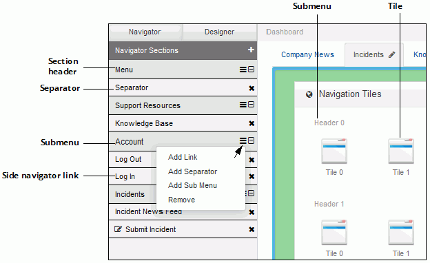
Links can be included on a left side navigator (accessed by the  icon in the upper left corner of the screen) and as
icons in the Navigation Tiles component on a dashboard. Features accessed
via a navigator link will display full-screen, and you can associate a
tutorial to display the first time a customer accesses the link.
icon in the upper left corner of the screen) and as
icons in the Navigation Tiles component on a dashboard. Features accessed
via a navigator link will display full-screen, and you can associate a
tutorial to display the first time a customer accesses the link.
To display the left side navigator opened and pinned when a customer first accesses the portal, use the Pin Navigator by Default field in the Settings section on the Basics tab in the Options screen.
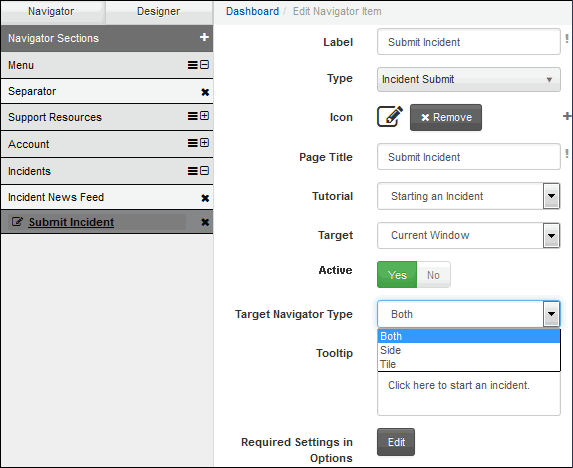
When creating a new navigator, you’ll first need to add a section header
via the Add Section icon;
then use the Add menu
icon to add links, separators, and submenus. The Edit
Navigator Item screen will appear for configuring
a link, submenu, or separator. Note that the fields will change depending
on your selection in the Type field, and you can drag and drop links under
section headings.
Label |
Enter the label to display for the link in the left side navigator and in the tile component. |
Type |
Select one of the following:
|
Icon |
If
desired, click Choose Icon |
Page Title |
Enter the text to appear in the browser tab when the details of the selected feature appears. |
Tutorial |
Select the tutorial to appear when the customer clicks the navigation item for the first time. |
Target |
Select:
|
Active |
Select No to prevent the link from appearing on the navigator. |
Target Navigator Type |
Select:
|
Tooltip |
Enter the text to appear when you hover over the link with your mouse. |
Required Settings in Options |
Click the Edit button to display the Options settings applicable to your selection in the Type field. |
 to upload a .png, .jpg, .gif, or .bmp file to appear to
the left of the link.
to upload a .png, .jpg, .gif, or .bmp file to appear to
the left of the link.