 Configuring Dashboards and
Components Configuring Dashboards and
Components
Configuring Dashboards and
Components Configuring Dashboards and
Components
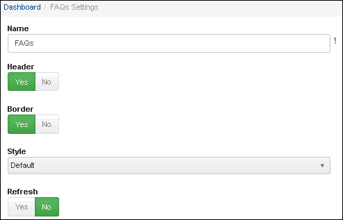
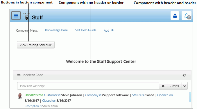
You can provide access to mySupport features via buttons and components, which are small frames that are placed in rows and columns on a dashboard. For components, you can enable a border and header at the top and select the alignment (left or center) and style color. Buttons in the Button component provide one-click access to features. You can enable customers to add dashboards and components that you make available via Options; customers can also change the name, header, etc.
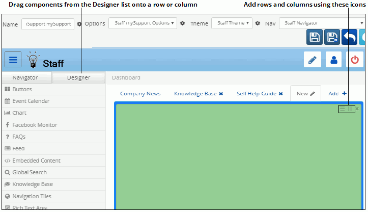
To include a component, drag it from the Designer list on the left onto a row or column on a dashboard.
The Component settings dialog appears with settings for enabling a header and border and other options applicable to the feature. If a header is enabled, a Style field will appear for selecting color/shade of the component header. Options include gradient and solid versions of colors defined in the Edit Basic Theme screen.
After adding a component you can click on the icon in the upper left corner of the header to display the Select Icon dialog for selecting a different icon. Note that you cannot disable this icon.
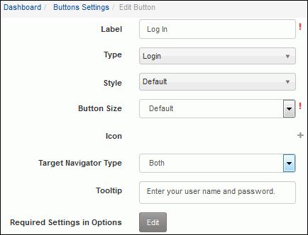
To configure a component with buttons, drag the Buttons component. In the component settings dialog, click the Add link. The Edit Button dialog appears; specify the button name, feature to access, style, size, icon, and tooltip.