![]() Using the Content Manager
Using the Content Manager
![]() Configuring
iSupport Views, Charts, and Alerts
Configuring
iSupport Views, Charts, and Alerts
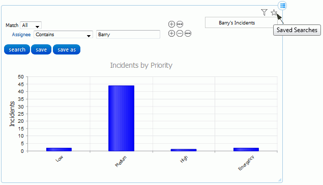
Support representatives can view charts via the Chart or Gauge
![]() component on the Desktop,
and customers can view charts via mySupport portals. You can restrict
access to specified support representatives, customers, and/or groups.
component on the Desktop,
and customers can view charts via mySupport portals. You can restrict
access to specified support representatives, customers, and/or groups.
Use the Chart Designer to create a chart or gauge for displaying data on any view field. You can create a gauge for charting one view field value or a bar, column, line, pie, or area chart for depicting multiple value types if applicable for a view field. Example See the next section for more information. Note that mySupport charts have the same configuration fields as Rep charts, but can only appear on a mySupport portal.
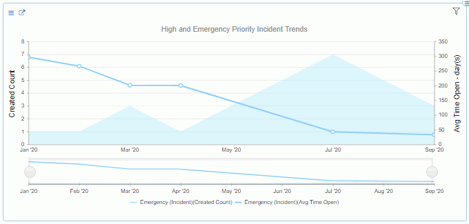
Use the Work Item Chart Designer to create
work item charts that display data in area, stacked area, bar, stacked
bar, column, and stacked line format for tracking incidents, problems,
changes, and purchase requests for a specified time frame. Example
You can set colors and multiple chart parameters and time frame types
such as quarterly and yearly trending. Saved Rep Work Item charts
will appear in the Work Items module in the Content Manager and in
the Work Items folder in the Chart component configuration  dialog. (Note that work
item charts cannot be included on mySupport portals.) See Creating
a Work Item Chart below for configuration information.
dialog. (Note that work
item charts cannot be included on mySupport portals.) See Creating
a Work Item Chart below for configuration information.
To create a chart for display on the Desktop,
select Desktop Content | Chart Designer on the Desktop Content  menu or Rep Chart on the
Create menu in the Content Manager. To create a chart for display
on a mySupport portal, select
mySupport Content | Chart Designer on the Desktop
Content menu or mySupport Chart on the Create menu
in the Content Manager.
menu or Rep Chart on the
Create menu in the Content Manager. To create a chart for display
on a mySupport portal, select
mySupport Content | Chart Designer on the Desktop
Content menu or mySupport Chart on the Create menu
in the Content Manager.
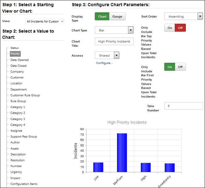
To get started, you’ll need to select the view on which to base the chart. The values in the selected view will appear under Step 2; select the value that you wish to monitor. If it is an existing chart, you can click the Edit link to open the View Designer to change the selected view to incorporate the value you wish to monitor. Use the fields in the Step 3: Configure Chart Parameters section to design the chart. Chart Example
Display Type |
Select:
|
Chart/Gauge Type |
|
Label Rotation (for charts) |
Select the positioning of the labels: 0, 45, or 90 degrees. |
Legend Position (for pie charts) |
Select the positioning of the labels for pie charts: Top, Bottom, Left, or Right. |
Sort Order (for charts) |
Select the direction in which to sort the chart: Ascending (increasing) or Descending (decreasing). |
Access |
Select:
|
Only Include the Top <entity> Values Based on Total <entity> (for charts) |
Select On to only include a specified number of the top grouping; for example, to only include the top ten companies. |
Only Include the First (Entity) Values Based Upon Total (View Entity) (for charts) |
Select On to only include a specified number of values, from the start of the list according to the specified sort order. Then enter the number. For example, if selecting incidents by followup date in descending order, enter 6 to only include the first 6 dates from newest to oldest date. |
Display Counts as Percentages |
Select On to display percentages instead of number counts. |
Select Chart Color |
Select the color to display for the selected value. You can select multiple colors for pie charts. |
Max Gauge Value (for gauges) |
Enter the number to appear at the top of the gauge. Note: Depending on your gauge limit, iSupport will attempt to spread that value over the range of gauge tick marks, in whole integer values. Some values may not display well as they are calculated across the gauge face. For example, a quarter gauge, with a limit of 5 has the value 2 displayed twice on the tick marks, changing the value from 5 to 6 will cause the gauge to look correct and convey better information. |
Gauge Face Color (for gauges) |
This field appears if Full, Half, Quarter, Horizontal Thermometer, or Vertical Thermometer is selected in the Chart Type field. Select:
|
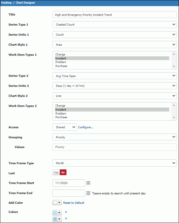
To create a rep work item chart, select Work Item Chart Designer on the Desktop Content menu or open the Content Manager and select Rep Work Item Chart on the Create menu. Example
Title |
Enter a title for the chart. |
| Series Type 1 | Select the type of calculation for the first set of criteria: Total Time Open, Average Time Open, Total Time Worked, Average Time Worked, Total Business Time Open, or Average Business Time Open. Note that the Total Business Time Open and Average Business Time Open options only apply to incidents. |
| Series Units 1 | This field applies to all options except Count in the Series Type 1 field. Select the unit of time for the time-based option selected in the Series Type 1 field: Minutes, Hours, or Days (1 day - 24 hours). |
| Chart Style 1 | Select the format for the first set of criteria: area, stacked area, bar, stacked bar, column, line stacked, or scatter line. |
| Work Item Types 1 | Select the work item record types to chart for the first set of criteria. |
| Series Type 2 | Select the type of calculation for the second set of criteria: Total Time Open, Average Time Open, Total Time Worked, Average Time Worked, Total Business Time Open, or Average Business Time Open. |
| Series Units 2 | This field applies to all options except Count in the Series Type 1 field. Select the unit of time for the time-based option selected in the Series Type 2 field: Minutes, Hours, or Days (1 day - 24 hours). |
| Chart Style 2 | Select the format for the second set of criteria: area, stacked area, bar, stacked bar, column, line stacked, or scatter line. |
| Work Item Types 2 | Select the work item record types to chart for the second set of criteria. |
| Access | Select:
|
| Grouping | Select the field and field value(s) to chart for the specified work item type or select None to chart a count for the specified time frame. |
| Time Frame Type | Select the duration on which to chart the selected field values. |
| Last | Select Yes to include data for past time frame intervals and then enter the number of intervals in the Last Interval field. In the example above, the chart will present data for the last 11 weeks. |
| Time Frame Start/End | This field appears if No is selected in the Last field. Select the dates for the time frame on which data should be presented. |
| Add Color/Colors | The Colors field includes the colors to display for the values in the Values field; the order from top to bottom will correspond to the order in the Value field. Use the Add Color field to select a color to add to the list. |